Showing posts with label B5. Show all posts

Wednesday, 30 May 2012

OUGD303 Evaluation


Natalie Jackson
OUGD303
Evaluation
Throughout this module, I have found that organisation skills have been critical in order to get the work done on time and to a good quality. Although I have struggled to keep up with my own deadlines, I have managed to get my work done to a satisfactory standard.
I have found that all my briefs ran over the deadline I set myself, and as a consequence, I felt stressed and panicked when coming to finishing the briefs.
If I was doing this module again, I would make sure to set out  a week and day by day plan, so I know exactly where I am and what I am doing, as I found that I wasn’t giving a brief 100% of my attention, as I was mixing them about due to late starting and getting tired of a brief.
However, I have learnt a lot from the briefs I have set myself and thoroughly enjoyed the initial designing and concepts.
For my first brief, I was really excited to get started as I organised exactly what it was I was looking into, and set myself limitations, with a culture and a theme. The problem I had with this brief was not making my decisions quick enough, and the yearbook brief took over the majority of my time, which meant I didn’t completely finish this brief like I wanted. I learnt a lot with this brief, in regards to packaging and looking into japanese design. I liked the idea of mixing an english picnic with japanese food food packaging, as this really stands out in that culture.
I would have liked to produce a few more deliverables, such as bunting (for the event), cheese board, with the design cut into the wood, labels and a larger range of packaging, for children/men/women/different operas.
My second brief took me a while to get the ball rolling, as I struggled with illustration designs and staying clear of the original Beatrix Potter illustrations. I went down the line of using type as image, but decided that this type of design wouldn’t be of interest to children 5-8. I designed simple characters, and by using a water colour effect on the designs, I was able to keep a vintage feel, which is something I wanted to keep. I would like to perfect this brief more as there are still pieces missing from the project and areas that I want to develop.
The Madness revive albums started to become an exciting brief once I had come up with the illustrations for the covers, by using a song - from that particular album - as inspiration, whether it be a song lyric or the name. I should have done a range of albums using different colours and package design to make them a bit more exciting and ‘mad’. The fez was a later idea, as I wanted something that Madness fans would appreciate, and quite ‘out there’. I should have experimented and researched bespoke packaging more, as making the fez took a lot of time, and there might have been a better solution.
My one day brief is the project I am not happy about. I left it very late and I still had projects that were unfinished and it took a back seat. I had already designed the Burlesque poster, but I should have done much more research into burlesque dancers and events. I would like to develop the brief much more, designing the full burlesque party event.
Finally the yearbook. This was the brief that ran on throughout the module and was very time consuming. From the beginning of the brief to the end, we met up with the yearbook team at least once a week to make sure they were happy with the design and layout. Looking back, I think we met up far too often, and we spent far too much time trying to perfect the book too early on. We also had a member leave the group part way through, which put a bit of a strain on the group, however, we managed to keep enthusiastic in meetings and kept the fine art team on our side. I am very pleased with the overall book and flyers and how we worked as a team. I was also impressed with myself, as I was mainly presenting the work in front of the client and organising meetings and being the point of contact, which I didn’t think I would ever do.
Overall, I have found that my time management still needs improving and decision making, but I have also felt that I have learnt something different with each brief, which has developed my skills in design and myself as a designer.

Monday, 28 May 2012

Yearbook Submission Boards


Evaluation

I was in a design team with Gemma, Kirsty and Nick and we worked on the Fine Art yearbook. At the beginning of the brief, I was very excited and anxious about working with a team and with a group of fine art clients.

A problem we had straight away was a lack of communication, within our own group and with the client, as we were all unsure about our cover design and the client said they liked it, however, after 4 weeks, we had a member leave the group and we then found that the client didn't like our ideas after all. From then on, we all made sure that if we didn't like an idea or design, that we would say, otherwise the yearbook wouldn't work out.

The layout was liked quite close to the beginning, but we struggled with the concept of 'Original Rework', as the fine artist's came up with the concept, we had to ask for the meaning, and it took a bit of time to understand. But we got there in the end!

This brief has taught me a lot, in regards to working with a group of graphic designers and with a real client.. or set of clients. I found that I grew in confidence, as I was consistently talking about my ideas and presenting the work we had done to the clients on a weekly basis.

Monday, 26 March 2012

The final 3 covers


The decision comes down to 3 cover colour variations.. The discussion went on how vibrant the colours were and which one would make a passer by stop and look.. the middle cover is the one we went with in the end, as the beige background stood out more and the bright pinky/red made you look, compared to the other 2 colours.

Thursday, 22 March 2012

Grid and Layouts


Grid for the book.. column width in.. all exhibitors on the left page, special projects have image on the left and text on the right..

Friday, 16 March 2012

Fine Art cover page..


Carrying on with the stamp idea.. keeping it simple, so it stands out, but took more of the stamp away to make it look a bit more stamp like.. I think these work better..


How the layouts inside might work along with the stamp..


Using 2 stamp variations, they have been placed on the white text page of the layout.. this could be varied with different pages.. though keeping it the same will keep it consistent..


I think that the designs where the stamp is in the top right corner with the line running under the title work best, as this would as the line used previously and is quite effective..


With the low opacity, this doesn't distract the reader from the work shown..


We are going to look at using the stamp in the special pages too.. this may work with these layouts.. or will be used instead of..

Thursday, 8 March 2012

Layouts..


After another meeting with the fine art yearbook team, they wanted to keep a line running under the name, and to come up with a rule for using it.. so we did some more layouts to give a better idea of what the publication might look like..

layouts


After feedback, changed the layouts.. need to get together with team to make sure the grid is properly laid out.. so all are the same..

Wednesday, 29 February 2012

Final Layout

After a few meetings, we have come up with the layout of the yearbook.. where the contact information will be sat and the statement and name.. 


There will be a line that stays on the same level throughout the book, to keep consistency, and the name will be above and statement below, either starting where the line starts, or ending where the line ends.. depending if it is on the right or left side..


Contact info will be in the bottom column under where the information is..


Thursday, 16 February 2012

More Layout Designs

Some layout designs for the fine art year book.. looking at areas they liked when looking through some ideas.. looking at placement of image and text.. variations.. not all the same layout..


Tuesday, 14 February 2012

Quality Stamp Vectors


New stamps.. which will be on the front of the yearbook.. next step is to make them look more stamp like, scanning in the texture.. erasing some parts, making it look rough..

Friday, 10 February 2012

Quality stamp


After a few meetings, we were discussing how the stamp could be made to look more stamp like, I have tried doing this by changing the stroke on the stamp lines.. they weren't keen on the stars at all.. and weren't 100% on board with the lines..

Wednesday, 1 February 2012

My FMP Briefs

1. Picnic

2. Beatrix Potter
3. Madness

4. Burlesque Kit

5. Yearbook


Friday, 20 January 2012

For Meeting..


The Fine Art Year Book: FINE ART - SHEILA.GAFFNEY@LEEDS-ART.AC.UK
For Monday- 
General questions for Lorenzo on Wednesday
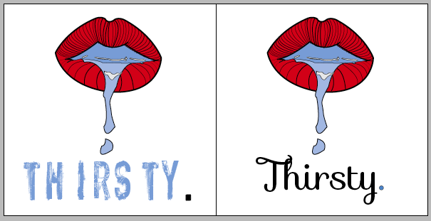
Own take on the thirsty concept.. Think about layout.. what will the double page spread look like?
@ 4.30pm = meeting to show stuff done over the weekend..
QUESTIONS:
Additional to yearbook.. will it be more than a yearbook?