Monday, 28 May 2012

Yearbook Submission Boards


Evaluation

I was in a design team with Gemma, Kirsty and Nick and we worked on the Fine Art yearbook. At the beginning of the brief, I was very excited and anxious about working with a team and with a group of fine art clients.

A problem we had straight away was a lack of communication, within our own group and with the client, as we were all unsure about our cover design and the client said they liked it, however, after 4 weeks, we had a member leave the group and we then found that the client didn't like our ideas after all. From then on, we all made sure that if we didn't like an idea or design, that we would say, otherwise the yearbook wouldn't work out.

The layout was liked quite close to the beginning, but we struggled with the concept of 'Original Rework', as the fine artist's came up with the concept, we had to ask for the meaning, and it took a bit of time to understand. But we got there in the end!

This brief has taught me a lot, in regards to working with a group of graphic designers and with a real client.. or set of clients. I found that I grew in confidence, as I was consistently talking about my ideas and presenting the work we had done to the clients on a weekly basis.

Madness Submission Boards


Evaluation

I really enjoyed illustrating the covers of the albums. I found that I used a lot more of photoshop in this brief, which is something new to me, and I have been able to develop my knowledge with the software.

There is a lot more that can be done to this brief to make it much stronger and have a larger range of deliverables. I would have like to design promotional material for an anniversary event and made the packages a bit more quirky and 'mad' to reflect the band and ska genre.

I could have produced more album covers, staying with the idea of using the name or lyrics, and designing an illustration that reflects that,

Beatrix Potter Submission Boards


Evaluation

I needed to keep clear of the original Beatrix Potter illustrations to make this project work. Because of this, I was staying to close to home and not thinking outside the box, my drawings were very similar to those of the original books.

I finally came up with a simple design that reflected the character from Beatrix Potter but was also quite different. I think the range works nicely, but could still be developed.
I wanted to have illustrated at least another book to go with Peter Rabbit, but I ran out of time, as I didn't realise I was going to be designing a story. To start with, I chose to design covers, but I changed the brief slightly so I could work with doing story illustrations.

Found it really challenging, but I was also inspired by the rules I could set myself in regards to how the illustrations and backgrounds would look like (point of view, time of day etc)

Portfolio


Saturday, 26 May 2012

Deliverables


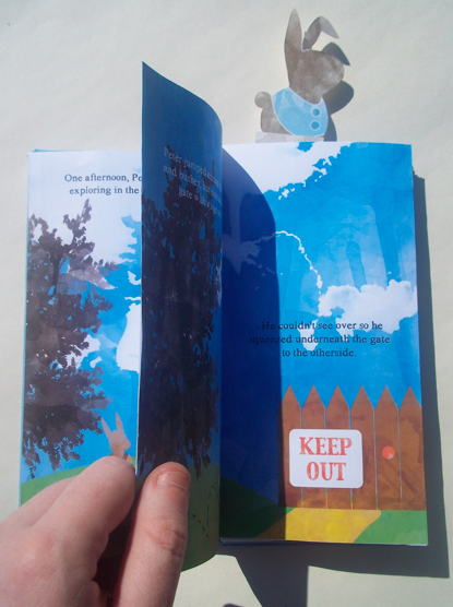
I would have liked to print the story onto thicker paper and more off white.. it is quite flimsy.. but the colours are nice and bright.. I feel that it could have done with being toned down a little.. (by the paper)

Overall, I like how the range works together.

Thursday, 24 May 2012

Cards


Some playing cards.. that will will be postcard size for children to learn the alphabet.. if I had more time, I would make them look a bit more playful.. they are quite basic.. I have kept the textures consistent with the rest of the products.. so they fit in.. but I haven't been able to do same illustrations.. this is something I will change at a later date.. 

My Website

Slowly coming together.. Nick was helping me understand Indexhibit.. and I am slowly getting the hang of it.. I need to spend more time looking into html and being able to move parts around.. but I can upload my work and get pages on.. so it's coming along..


The portfolio section: I have decided that I want to keep briefs separate on different pages, and thumbnails come up and when pressed you can go through them at a larger scale.. quite clever!!