Tuesday, 15 May 2012

Inside cover..

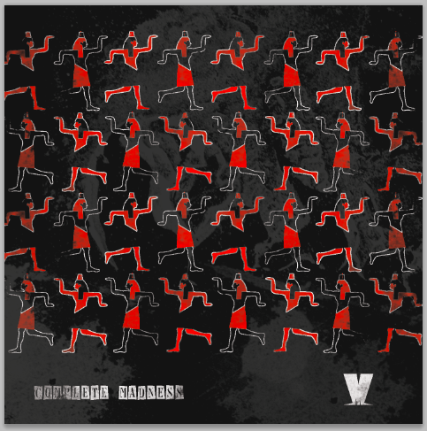
The previous inside designs looked well too tacky, and I need to find a way of showing the images I have of madness in a better way, but they are a naff quality..


Using the same kind of brushes as the front cover, I have tried to make it look a bit better.. this would also be the potential poster that is inside.. if it can be blown up.. 


Really like the stamp of the band, this works really well.. might have to do it for other images, think it works better than the actual image above.. 


Too dark this way round.. need to try it on different background and erasing parts maybe?


Layout needs more work.. either more texture needed down at the bottom.. looks a bit uneven..


Monday, 14 May 2012

Touching up:

Really didn't like how the other covers looked and so I am going back and doing them again.. with a  better idea of how I want them to look..


Keeping with the grungy looking effect, I have made it a bit more textured looking.. a using the background more as the image..


Maybe look at changing the background colours, with red and making the images more black.. play with this idea for more of a range, and shows the different covers off..
But they would still work as a collection as they use the same textures..


Thinking whilst going along.. the cd itself could be the background of the cover.. each one is different.. or maybe take a small part of the image as well.. do variations to see which works best..


Maybe have the same amount of red as there is black.. x4 black and x4 red.. so there isn't more of one colour.. or just depends on the image, and what works best.. change the black and grey round so it is darker..


Think they are all working well together.. just another few to do.. then I need to work on the inside of the cover, as it looked horrible before.. I need to find a way of using madness' images, but so they don't look stuck on.. maybe try and use the same effects as the cover.. 


Found this one difficult to do as there is quite alot of detail.. may need to go back and re do a bit before happy.. same with the 'one step beyond..'


This red and white works well.. the one step beyond needs looking at again, it looks a bit messy, need to find out another way of showing that cover.. having 3 red and the rest more black will work alright together as well.. however, need to print out to make sure and see together..

Need to work on the inside of the cover now..


Saturday, 5 May 2012

Cover Ideas:


Now that I have decided on the kind of look my book will be, I can start designing the cover.. keeping it simple and 'vintage' like..


[Hand drawn images]


I like the bottom layout more than the others, I think a bit more work needs to be done.. but I like the simplistic look to it.. Also, the other cover designs can follow the same look, with a different colour, and character head..


Some colour variations that can be used for all the books, not just the one.. the stock that needs to be used as the cover needs to look quite delicate I think.. 


Using the illustrated peter rabbit image as the front cover.. this will have to be repeated in the book somehow too.. to keep consistency.. maybe an object on each page?


The image needs to be bigger, like peter.. not keen on the blue colour.. THIS NEEDS SORTING NOW.. need to stop panicking..

I also like the washed out cover more.. less is more!!


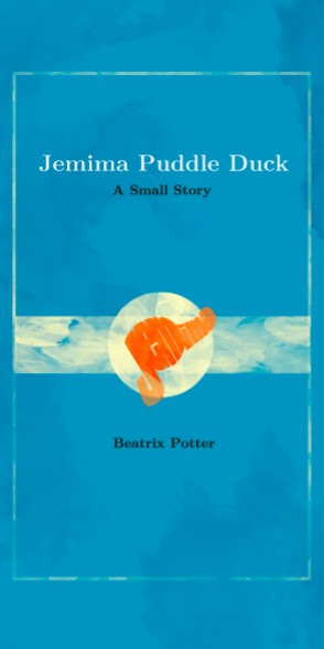
I am going to use these colours for the covers:

Peter = Green
Jemima = Blue
Tiggywinkle = Orange

Need to sort out what is going on the cover (pattern?) need to keep the washed out look too.. maybe not so much?

Maybe have stickers for the front, so the actual cover will be a brown wrapping paper type stock.. DECIDE!


Use lines as a bit of detail for page, this may vary for each cover..


There needs to be some kind of border.. and the colour needs working on more.. not keen on the black.. 


Friday, 4 May 2012

Including Characters & Text


After speaking with Mark, he gave me some really good advice on how to do this properly.. 
Firstly looking at the backgrounds specifically, baring in mind that characters and text will be placed somewhere, then printing them all out and drawing on roughly where you intend on the characters being..

He also made me think about point of views and scales, whether you were looking at the rabbit, or from the rabbits point of view.. also looking at the sky, does it change as the story goes on, showing the time of day.. and if anything stays the same, to make rules for myself..

The layouts I did before with all the rabbits was very cluttered, and it didn't work, there was just too much going on.. so I have simplified the story as well as the images, just to condense it and make it more about Peter Rabbit..


Looking at how the text might work.. not in a straight line.. I don't think this is sitting right.. It would be nice to have a raw typeface, maybe slightly old looking, serif?

I am going to go with this typeface, looks quite rough and old looking, which is the look I'm going for.. need to get the text in the right place and make sure it doesn't crowd the composition..


I have found a times typeface that is hand drawn, which looks quite old and antiquey like.. 


backgrounds..


Here are the backgrounds.. there are a few things I need to change, now that I have printed them out, I can see them better.. Some of the colours in the sky are too dark, and affects the wash of colour I wanted for the book.. Also, the shed needs to be made bigger.. just to show how small Peter is..


Next step after changing these is to include the characters and type.. I have drawn on the print out, to give me an idea of where these things might go.. need to scan that in toooo!!