

Tpefaces that I have circled I think work better than the others.. I prefer the above typeface, with it being quite thin and italic, which is what I had in mind to begin with..
Opera:
- Dramatic
- Acting, scenery and costume (and maybe dance)
- Orchestra
- Renowned figure = Mozart (comic opera- The Marriage of Figaro, Don Giovanni, and Così fan tutte, as well as The Magic Flute, a landmark in the German tradition..)

I used the typeface CAC Champagne, and I had a play with the letters, for example here, the 'O' has been repeated and reflected and put together, to make a nice pattern.. this could be the actual logo for party in the park, which might be seen on the picnic products and other products that can be bought whilst at the event.. flags/food/clothes..
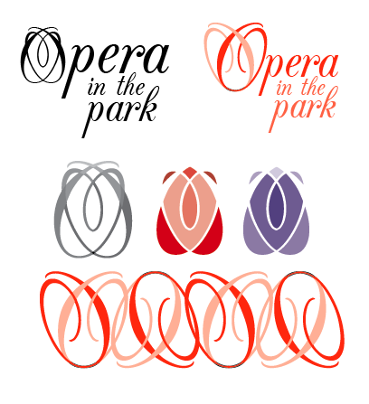
Playing around with colour a bit.. and with 'O'.. this pattern could be used on the napkins and blanket.. if I can collect a range, then I can transfer them on to my products.. or maybe have a range of colours.. as the patterns may look too different.. and not consistent..

When I think about operas, I think of a bouquet of roses for the leading lady at the end.. I have had a play with the 'O' and the 'P' from 'Park', and found that I can create a rose type symbol.. this might be able to be used.. i don't know..

I like the 'park' bit.. not sure on the rest.. I feel like it is quite big.. and thinking about it now.. I'm thinking rugby.. but the swirlyness of the rose might break that association.. just need to talk to someone about it..

I took the 'O' from opera away, making the rose the 'O' instead.. I thought doing this would make the 'opera' not readable, but I think you can understand what it says.. I have also moved the 'O' and the 'P' closer together, to bring the whole sentence together.. which I think looks much better and together..
No comments:
Post a Comment