Wednesday 30 May 2012

OUGD303 Evaluation


Natalie Jackson
OUGD303
Evaluation
Throughout this module, I have found that organisation skills have been critical in order to get the work done on time and to a good quality. Although I have struggled to keep up with my own deadlines, I have managed to get my work done to a satisfactory standard.
I have found that all my briefs ran over the deadline I set myself, and as a consequence, I felt stressed and panicked when coming to finishing the briefs.
If I was doing this module again, I would make sure to set out  a week and day by day plan, so I know exactly where I am and what I am doing, as I found that I wasn’t giving a brief 100% of my attention, as I was mixing them about due to late starting and getting tired of a brief.
However, I have learnt a lot from the briefs I have set myself and thoroughly enjoyed the initial designing and concepts.
For my first brief, I was really excited to get started as I organised exactly what it was I was looking into, and set myself limitations, with a culture and a theme. The problem I had with this brief was not making my decisions quick enough, and the yearbook brief took over the majority of my time, which meant I didn’t completely finish this brief like I wanted. I learnt a lot with this brief, in regards to packaging and looking into japanese design. I liked the idea of mixing an english picnic with japanese food food packaging, as this really stands out in that culture.
I would have liked to produce a few more deliverables, such as bunting (for the event), cheese board, with the design cut into the wood, labels and a larger range of packaging, for children/men/women/different operas.
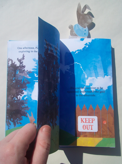
My second brief took me a while to get the ball rolling, as I struggled with illustration designs and staying clear of the original Beatrix Potter illustrations. I went down the line of using type as image, but decided that this type of design wouldn’t be of interest to children 5-8. I designed simple characters, and by using a water colour effect on the designs, I was able to keep a vintage feel, which is something I wanted to keep. I would like to perfect this brief more as there are still pieces missing from the project and areas that I want to develop.
The Madness revive albums started to become an exciting brief once I had come up with the illustrations for the covers, by using a song - from that particular album - as inspiration, whether it be a song lyric or the name. I should have done a range of albums using different colours and package design to make them a bit more exciting and ‘mad’. The fez was a later idea, as I wanted something that Madness fans would appreciate, and quite ‘out there’. I should have experimented and researched bespoke packaging more, as making the fez took a lot of time, and there might have been a better solution.
My one day brief is the project I am not happy about. I left it very late and I still had projects that were unfinished and it took a back seat. I had already designed the Burlesque poster, but I should have done much more research into burlesque dancers and events. I would like to develop the brief much more, designing the full burlesque party event.
Finally the yearbook. This was the brief that ran on throughout the module and was very time consuming. From the beginning of the brief to the end, we met up with the yearbook team at least once a week to make sure they were happy with the design and layout. Looking back, I think we met up far too often, and we spent far too much time trying to perfect the book too early on. We also had a member leave the group part way through, which put a bit of a strain on the group, however, we managed to keep enthusiastic in meetings and kept the fine art team on our side. I am very pleased with the overall book and flyers and how we worked as a team. I was also impressed with myself, as I was mainly presenting the work in front of the client and organising meetings and being the point of contact, which I didn’t think I would ever do.
Overall, I have found that my time management still needs improving and decision making, but I have also felt that I have learnt something different with each brief, which has developed my skills in design and myself as a designer.

Tuesday 29 May 2012

M&S Picnic Submission Boards


Evaluation

When starting this brief I made sure that I set my limitations and gave myself a theme and culture to research and look into. I really got into this brief at the beginning, and had some good initial ideas. I think I could have developed the brief much more, using more food and looking further into the culture. I would have liked to produce more ranges, so the target audience (being quite varied, as families go to this kind of event) could all be included in the picnic.. women, men, children..

It would have also been good if I could have done more picnic design packages for different operas, maybe looking into other cultures and how the food packaging varies in each country.


Submission boards Print: The colour on the boards didn't come out well at all.. the ink or something went wrong over night, so the red has turned a nasty yellow colour.. and it doesn't show the work off great at all.. shame :/ 

Burlesque Submission Boards


Evaluation

I found it difficult to start this brief, as it changed a few times throughout the module, from being about burlesque, to the secret and the hidden.. but after a crit, it was suggested that I could produce a burlesque kit, that was meant to be fun and entertaining. This grabbed my attention and I was excited to start the brief. 

Time passed and I found myself still needing to start this brief, I'm not happy at all with the outcome and would like to spend much more time on it. This brief has much more potential and has many more deliverables that can be produced.

I haven't researched the theme enough, and this is one reason why the brief has suffered. I need to experiment with the 'logo' more on the packaging and take different parts from the poster to find a design that works better.

Monday 28 May 2012

Yearbook Submission Boards


Evaluation

I was in a design team with Gemma, Kirsty and Nick and we worked on the Fine Art yearbook. At the beginning of the brief, I was very excited and anxious about working with a team and with a group of fine art clients.

A problem we had straight away was a lack of communication, within our own group and with the client, as we were all unsure about our cover design and the client said they liked it, however, after 4 weeks, we had a member leave the group and we then found that the client didn't like our ideas after all. From then on, we all made sure that if we didn't like an idea or design, that we would say, otherwise the yearbook wouldn't work out.

The layout was liked quite close to the beginning, but we struggled with the concept of 'Original Rework', as the fine artist's came up with the concept, we had to ask for the meaning, and it took a bit of time to understand. But we got there in the end!

This brief has taught me a lot, in regards to working with a group of graphic designers and with a real client.. or set of clients. I found that I grew in confidence, as I was consistently talking about my ideas and presenting the work we had done to the clients on a weekly basis.

Madness Submission Boards


Evaluation

I really enjoyed illustrating the covers of the albums. I found that I used a lot more of photoshop in this brief, which is something new to me, and I have been able to develop my knowledge with the software.

There is a lot more that can be done to this brief to make it much stronger and have a larger range of deliverables. I would have like to design promotional material for an anniversary event and made the packages a bit more quirky and 'mad' to reflect the band and ska genre.

I could have produced more album covers, staying with the idea of using the name or lyrics, and designing an illustration that reflects that,

Beatrix Potter Submission Boards


Evaluation

I needed to keep clear of the original Beatrix Potter illustrations to make this project work. Because of this, I was staying to close to home and not thinking outside the box, my drawings were very similar to those of the original books.

I finally came up with a simple design that reflected the character from Beatrix Potter but was also quite different. I think the range works nicely, but could still be developed.
I wanted to have illustrated at least another book to go with Peter Rabbit, but I ran out of time, as I didn't realise I was going to be designing a story. To start with, I chose to design covers, but I changed the brief slightly so I could work with doing story illustrations.

Found it really challenging, but I was also inspired by the rules I could set myself in regards to how the illustrations and backgrounds would look like (point of view, time of day etc)

Portfolio


Saturday 26 May 2012

Deliverables


I would have liked to print the story onto thicker paper and more off white.. it is quite flimsy.. but the colours are nice and bright.. I feel that it could have done with being toned down a little.. (by the paper)

Overall, I like how the range works together.

Thursday 24 May 2012

Cards


Some playing cards.. that will will be postcard size for children to learn the alphabet.. if I had more time, I would make them look a bit more playful.. they are quite basic.. I have kept the textures consistent with the rest of the products.. so they fit in.. but I haven't been able to do same illustrations.. this is something I will change at a later date.. 

My Website

Slowly coming together.. Nick was helping me understand Indexhibit.. and I am slowly getting the hang of it.. I need to spend more time looking into html and being able to move parts around.. but I can upload my work and get pages on.. so it's coming along..


The portfolio section: I have decided that I want to keep briefs separate on different pages, and thumbnails come up and when pressed you can go through them at a larger scale.. quite clever!!


STILL NEED TO DO:

Brief 1:


Plates & cups range
Menu
Bunting for event
More promotion
Labels for packaging


Brief 2:


Playing cards (learning alphabet & numbers)
Overall packaging?


Brief 3:


Labels & packaging for tshirts
Re-do Tshirts
CD Designs
Booklets to print


Brief 4:


- Burlesque Kit


Packaging
Booklet
How to.. do burlesque makeup


Brief 5:


Blog yearbook ..

Wednesday 23 May 2012

Design Context final book


Postcards together.. front and back..

Deliverables..


For some reason this tshirt transfer burned.. so it has a slight yellowness about it, which isn't good.. I would have liked to have had larger pieces of transfer paper so a larger image could be on the tshirts, as experimented with on photoshop..


The fez took hours to make.. it is more like a mock up, as in reality, it would probably be made out of plastic, to make it a bit more sturdy.


Tuesday 22 May 2012

Stickers


Stickers that would come with the book.. also seen on the overall packaging... that I NEED TO PUT TOGETHER!!

Peter Rabbit Story Telling..


Story telling event at the library.. would be seen blown up on a banner near and around leeds..

M&S poster


Got a print slot today, thank god!! so going to get my posters printed.. been working on the M&S  one that will be seen in the shop and on Lorries etc..


Using the same colours as the packaging but made it look a bit different so it will stand out more.. This would look quite nice on packaging as well..


Changed the colours around to see what difference that makes.. 

Design Context Book so far..

Finally putting together the book.. or postcards..


I have found some perforated a4 card from WHSmiths which will be very useful for this project.. It means that I can have them so you can tearaway or have them as postcards straightaway.. probably the latter..


And the packaging I am going to make for these will be like a pack of cards.. this is something I need to look into sooner rather than later..


Each postcard has an image on the back relating to what it says on the card..

Monday 21 May 2012

Album Covers


6 out of 8 covers.. printed onto glossy stock.. Think they work well as a set, however the last 2 that haven't been printed yet don't work I don't think..


On the inside there is info about that album and an image of the poster that comes with.. there is also a booklet, with lyrics in..


Rules for bellyband layout:

"A Short Story" needs to be in dark brown, 14pt and justified to the right, under the title..
The title needs to be in the same colour as the material on the book, 22pt and justified to the right
'Beatrix Potter" stays in the same place on the back in a dark brown 18pt


After printing out a set of mock up bellybands, there were a few things that were different from other bellybands, which need sorting to keep consistency with the designs..


Peter's band is wrong, and moppet is not in a green colour.. if I had time I could get them laser cut so the material just shows through..

Friday 18 May 2012

Bellybands for books..


Peter and Jemima so far.. I have covered the covers in material ready to put the story inside.. 
Another 3 to do..


Squirrel Nutkin.. (SPELT WRONG ON THE BAND.. NEEDS CHANGING) also.. the name needs to change to a more red/pink colour, to match the colour of the book..
The last book:


Need to print off and make sure the colour is right with the coloured material.. the band will be printed off in the same stock as the thick paper inside the book.. slighty off white colour..


Thursday 17 May 2012

Belly Band..

The book needs a bellyband to keep it shut.. so I am looking at making something that isn't just a strip of card.. have it a bit more playful.. which might mean that the cover won't need too much detail on it..


Looking at using the rabbit head.. this can be changed for each book.. coming out of the strip.. or even using the body, as the head may not be strong enough on its own.. (after talking to mark howe) he suggested using the body as well..


Bellyband with full body will work better I think, as it will work the full length of the book.. the book marks be visually similar as well.. 

Vector bellybands..


I am going to put the images into photoshop to make the texture look like the story inside..
Each book will be a different colour, but work altogether, and I want to try make the colour from the book work with the belly band somehow..


New Booklet


I have changed the backgrounds and look of the booklet to keep consistency with the albums.. they were too block colour before and no texture.. so this s what I have come up with..


Flicking through, some of the writing is difficult to read, so this needs to be changed.. 

Wednesday 16 May 2012

TSHIRT DESIGNS


Using the same kind of grungy backgrounds, and laying the vector image over the top.. quite a lot going on.. the image doesn't stand out enough.. try using just the image instead? ..


These look much better and stand out much more..a tshirt for each album too.. With the red looks better than just the line drawing.. need to do variations of where the image can be placed..


Having just one is a bit weird.. try more.. like the album..


These are much better.. the pattern could be made really small be the material rather than a print.. 


Looking at different scales of the clown face.. I think each one works quite well.. as you can tell what the image is quite quickly..


Keeping it simple and just using the street name.. there's quite alot in the design and it's too much to show on a tshirt design.. like the initial tshirt designs at the beginning..


I want to re-do this album cover anyway.. I'm not keen on the illustrations.. and the tshirt doesn't work..


This can also be scaled down too.. and in different colours.. maybe on a red tshirt.. need to look into this as well..