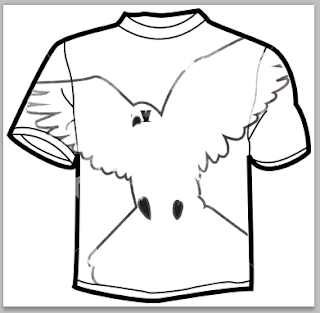
Using the same kind of grungy backgrounds, and laying the vector image over the top.. quite a lot going on.. the image doesn't stand out enough.. try using just the image instead? ..
These look much better and stand out much more..a tshirt for each album too.. With the red looks better than just the line drawing.. need to do variations of where the image can be placed..
Having just one is a bit weird.. try more.. like the album..
These are much better.. the pattern could be made really small be the material rather than a print..
Looking at different scales of the clown face.. I think each one works quite well.. as you can tell what the image is quite quickly..
Keeping it simple and just using the street name.. there's quite alot in the design and it's too much to show on a tshirt design.. like the initial tshirt designs at the beginning..
I want to re-do this album cover anyway.. I'm not keen on the illustrations.. and the tshirt doesn't work..
This can also be scaled down too.. and in different colours.. maybe on a red tshirt.. need to look into this as well..


No comments:
Post a Comment