


Keeping with the grungy looking effect, I have made it a bit more textured looking.. a using the background more as the image..

Maybe look at changing the background colours, with red and making the images more black.. play with this idea for more of a range, and shows the different covers off..
But they would still work as a collection as they use the same textures..


Thinking whilst going along.. the cd itself could be the background of the cover.. each one is different.. or maybe take a small part of the image as well.. do variations to see which works best..


Maybe have the same amount of red as there is black.. x4 black and x4 red.. so there isn't more of one colour.. or just depends on the image, and what works best.. change the black and grey round so it is darker..


Think they are all working well together.. just another few to do.. then I need to work on the inside of the cover, as it looked horrible before.. I need to find a way of using madness' images, but so they don't look stuck on.. maybe try and use the same effects as the cover..


Found this one difficult to do as there is quite alot of detail.. may need to go back and re do a bit before happy.. same with the 'one step beyond..'


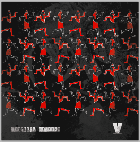
This red and white works well.. the one step beyond needs looking at again, it looks a bit messy, need to find out another way of showing that cover.. having 3 red and the rest more black will work alright together as well.. however, need to print out to make sure and see together..
Need to work on the inside of the cover now..
No comments:
Post a Comment